How to Design a Website: Simple Steps for Small Business Owners

A simple guide for small business owners to design a professional website using AI—no coding or design skills needed.

Frank Zhu
Frank is the founder of Readdy.ai. A developer-turned-founder with 10+ years of product experience, Frank loves great design, and he's building the tools he wishes he had when launching his first startup.
Over 73% of small businesses have a website, and that number is growing rapidly. This means that simply having a website is fairly commonplace. Your website needs to stand out from competitors. It needs to be professional and approachable while communicating your brand.
But building a website can feel overwhelming when you’re not a designer or a coder. But here’s the good news: You don’t need to be either. With the right approach—and the right AI tools—you can design a professional site that builds trust, communicates your brand, and helps your business grow.
Readdy, an AI-powered website builder, makes this process fast and stress-free. Instead of struggling with complex editors, you simply describe your business and goals. Readdy generates a live, professional site in minutes—saving you time while giving your business an instant online presence.
Let’s walk through the simple steps to designing a website that actually works for your business.
Why website design matters for small businesses
Over half of small business owners plan on investing in their website’s design and performance. Why? Because only 2% of consumers don’t search for local businesses online. This means that most small business customers are comparing websites and then deciding where to spend their hard-earned money.
A catchy domain name and functional pricing page aren’t enough. You have to rely on your website design to boost credibility, customer engagement, and sales.
First impressions count
You have just 50 milliseconds, less than a blink of an eye, for visitors to decide whether they want to stay on your site. In those moments, your colors, layout, and overall look do the heavy lifting.
For small business owners, this means your homepage and landing pages can’t afford to feel cluttered, outdated, or unprofessional. A clean design with strong visuals communicates credibility in an instant.
Design drives usability
Good design directly shapes how easy and enjoyable your website is to use. Studies show that visual design influences user experience by improving usability and literally creating pleasure. In plain terms, a well-designed website makes it simple for visitors to find what they need, and this makes visitors feel good.
Clear navigation menus, intuitive button placement, and mobile device responsiveness all boost usability. At the same time, an attractive layout and engaging visuals create that spark of delight that makes people stay longer. For small business owners, this means prioritizing both function and form.
Trust through professionalism
Why would users trust a product that comes from an unprofessional website? People instinctively judge the legitimacy of a business by its website design. If your site looks sloppy, potential customers may assume your products or services are the same. On the flip side, a professional website design builds trust.
Clean typography (fonts, letter and line spacing, setting line length, etc.), consistent branding, and well-chosen images all signal that you care about quality. Customers want to feel confident that their money and information are safe with you.
Readdy is an AI-powered website generator that helps you go straight from idea to a well-designed, stunning live site. Discover intuitive design tools that make it easy to customize fonts, layouts, and colors.
How to design your website with AI
Designing a website used to mean hours spent dragging blocks, resizing images, and learning design tools. But now, AI website builders like Readdy make it possible to go from an idea to a professional site in minutes—without touching a single line of code.
With Readdy, all you do is describe your business and goals in plain English. The AI instantly generates a complete website: layout, copy, images, and navigation. You can edit sections simply by typing prompts like “make the headline bolder” or “add a contact form.” No design or technical knowledge required.
What makes AI website design different
- Speed: Create a live, fully functional site in minutes instead of days or weeks.
- Ease of use: Skip manual layout and formatting—AI handles structure, spacing, and typography automatically.
- Customization: Adjust color palettes, fonts, and layouts through natural language, not complex menus.
- Consistency: AI ensures every page aligns with your brand’s tone and design style.
- Built-in optimization: AI-generated designs are automatically mobile-friendly and SEO-ready.
AI vs. manual website design: What’s right for you?
| Aspect | Designing with AI (e.g., Readdy) | Designing manually (Step-by-step) |
| Setup time | 5–10 minutes to generate a full site | Several hours to days depending on complexity |
| Ease of use | Requires no technical or design skills | Requires understanding of layout, colors, and design tools |
| Customization | Adjust with simple text prompts | Customize manually through menus or code |
| Design quality | Professionally balanced, auto-optimized | Dependent on user’s design skills |
| SEO readiness | Automatically optimized during generation | Requires manual setup and plugin management |
| Flexibility | Ideal for quick launches or SMBs | Better for large, custom projects |
| Best for | Small business owners and non-designers | Designers or users wanting deep control |
Once your AI-generated site is live, you can still tweak and refine it manually. The next section walks you through a step-by-step manual guide for those who want to learn or fine-tune their website’s layout and design.
Step-by-step guide to designing your site
Before we get started, you need to know the key elements of a strong layout:
- Clear hierarchy: Different text sizes and styles help guide readers naturally from headlines to body copy.
- Consistency: Repeat your layout structure across all pages for a cohesive experience.
- White space: Give your content room to breathe. Empty space prevents clutter and draws attention to your most important elements.
As we move into layout selection, navigation, images, and CTAs, keep these main tenets in mind. They are the basics you need to create a functional, appealing website. Now, let’s get started with the design process.
1.Choosing a layout
Designing a website layout isn’t about placing text and images on a screen wherever you feel like. It’s about creating a structure that feels intuitive to your visitors and supports your business goals. Beginners need a strategy to work off of, not vibes.
Start by planning your structure
Before you open any design tools, map out which pages your site will need. Most small business websites include a homepage, an About page, a services or products page, and a contact page.
Your homepage sets the tone for your entire site. A well-designed homepage should include:
1. A header with your logo and navigation menu
2. A hero section with a headline, supporting image, and call-to-action
3. Content blocks showcasing your services, products, or features
4. A footer with contact details, social media, and links to key pages
From here, think about how the other pages (service or product pages, FAQs, About page, etc.) connect and what journey you want visitors to take. We’ll cover in-depth navigation in the next section, but to design your layout, you need a basic idea of your structure.
Use a grid system
A grid layout divides your page into columns and rows, giving you a framework to neatly align text, images, and buttons. Grids prevent your site from looking chaotic and instead create balance, consistency, and readability. They’re flexible too, working equally well for all types of website—including online stores, blogs, or portfolio sites.
Prioritize content placement
Not all content is equal, so choose a layout that places your most important information, like key services, a headline, or a call-to-action, at the top of the page where visitors will see it first. Supporting details or background information can flow further down the page. This hierarchy ensures users don’t miss what matters most.
2.Structuring navigation
A website’s navigation determines how pages are organized and how visitors move through your site. Clear site structure ensures users can easily find what they’re looking for, while a confusing one risks losing them altogether. For this, you’ll need a sitemap and menus.
A well-structured sitemap paired with intuitive menus is the backbone of easy navigation, helping users reach their goals quickly and boosting overall site usability.
Sitemaps
A sitemap has two meanings: the structure of your site (how pages connect) and the page that lists all other pages. A good sitemap reflects your site’s hierarchy with clear labels and headings, not just a flat list. Well-planned sitemaps make navigation intuitive, often modeled after similar sites in your industry for consistency.
Menus
Menus reveal the site hierarchy to visitors and guide them through your content. Common placements include top navigation bars, sidebars, dropdowns on mobile, and utility menus in headers or footers. Menus also provide shortcuts to frequently used pages, improving usability and reducing frustration.
Example sitemap and menu
Here is an example sitemap and menu to help you visualize what your navigation could look like. Imagine how a customer will best find information and explore your website. In this example, the website is for a local bakery.
Homepage:
- About Us
- Menu
○ Breads
○ Pastries
○ Cakes
○ Seasonal Specials
- Order Online
○ Pickup
○ Delivery
- Catering Services
- Blog
- Contact
How this works in navigation:
- Primary menu (top navigation bar):
○ Home | About Us | Menu | Order Online | Catering | Blog | Contact
- Dropdowns/submenus (under “Menu”):
○ Breads | Pastries | Cakes | Seasonal Specials
- Footer menu (utility links):
○ Privacy Policy | Terms of Service | Careers | FAQ
3.Adding Visuals and media
Depending on your website builder and platform, the way you add media and visuals will differ. However, the main principles of adding visuals and media remain the same. Here are the best practices for website visuals.
- Plan early: Choose images during the layout stage so they support your design from the start.
- Use authentic photos: Whenever possible, feature real shots of your products, team, or location instead of stock images to create trust and a personal connection.
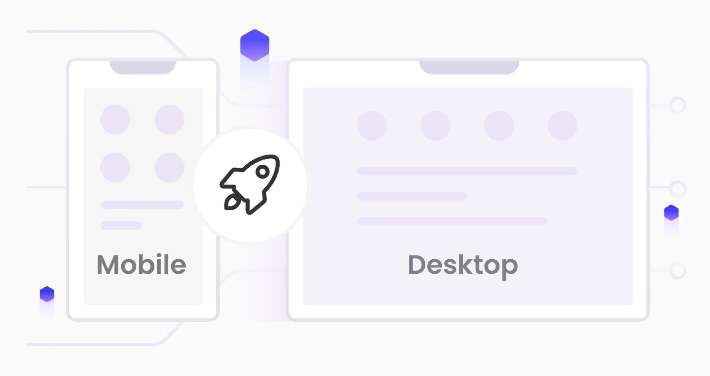
- Optimize for performance: Ensure images are responsive on all devices, compressed to keep load times fast, and paired with descriptive alt text for both SEO and accessibility.
- Be smart with animation: Simple animations can guide or instruct users, but keep file sizes small to avoid slowing your site.
- Prep alt text: This is the written description you add to an image on your website. It helps search engines “see” your website images and improves accessibility for visually impaired users.
4.Writing clear calls-to-action
Website calls-to-action (CTAs) take a variety of functions, from getting your target audience to provide an email to getting them to purchase a product. Regardless, every single CTA should have the following characteristics.
Make it impossible to miss
If your CTA blends in, it’s as good as invisible. Most visitors skim, not read, so your call-to-action should stand out in placement, size, and color. Avoid burying it mid-paragraph. Instead, place CTAs at the top and bottom of the page, and surround them with white space so they’re not competing with blocks of text.
Your CTA should look like a clickable invitation, not another line of text, and always test on multiple devices to confirm readability.
One page, one focus
Too many CTAs confuse people. Give visitors a single action to take so they know exactly what you want from them. If you have multiple goals, separate them onto different pages or posts.
For example, one blog post might direct readers to download a guide, while another leads them to sign up for a webinar.
Keep it short and repeat strategically
A CTA is not the place for a long sales pitch. Aim for two to five words that tell users exactly what happens when they click. Examples: “Get Your Free eBook” or “Start Saving on Taxes.” Simple, direct language performs best, and since people scroll at different speeds, some will catch your CTA at the top, with others only at the bottom.
Place it in multiple spots—above the fold, midway through, and at the end—for better coverage. On shorter pages, just the top and bottom is enough.
Add context and proof
Sometimes, a button alone won’t convince someone to act. A short line of text before the CTA can explain why it matters, like highlighting the benefits of your newsletter or product. You can also pair your CTA with social proof: reviews, testimonials, or screenshots from real customers.
Write copy that speaks directly to your audience
Generic CTAs like “Submit” or “Buy Now” rarely inspire action. Speak to your audience’s challenges and desires. If you’re targeting freelancers with bookkeeping services, emphasize what they gain: “Stop losing money on taxes” or “Save hundreds in unclaimed deductions.” Research shows personalized CTAs convert over 200% better than generic ones, so tailor your wording to your audience’s needs.
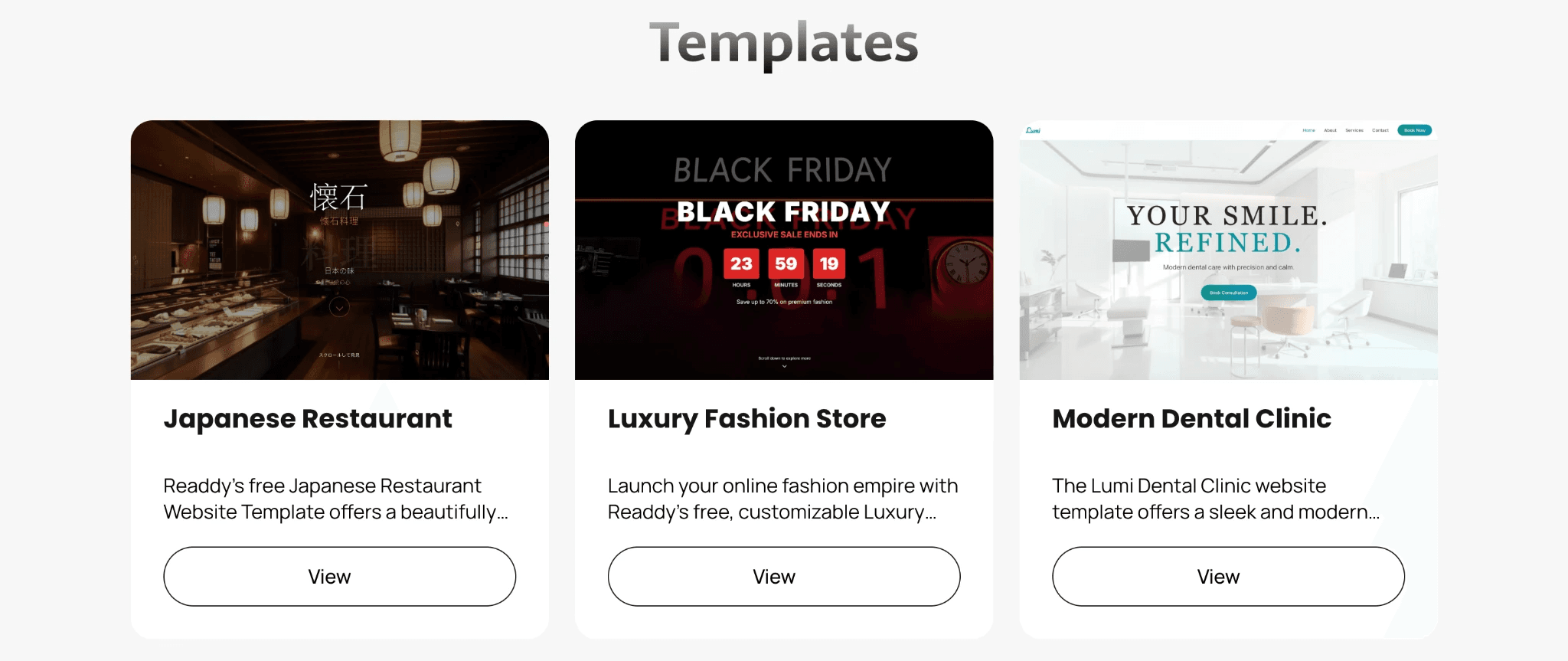
Tools and templates that make design easy
Starting from a blank page may feel overwhelming, and many small business owners find that using website templates is the easiest way to build a professional-looking site without needing to master design theory. With templates, you get a ready-made structure, so you can focus on adding your content and branding instead of worrying about HTML and technical details.
With templates, you:
- Save time: Instead of building layouts from scratch, templates give you a head start with pre-designed page structures.
- Look professional: Most templates are designed by web professionals who understand layout best practices, so your site looks polished right out of the box.
- Stay consistent: Templates help maintain a uniform look across pages, creating a cohesive brand experience.
One standout option is Readdy, an AI-powered website builder designed for simplicity. Readdy includes a growing library of high-quality templates designed for speed and flexibility. Every template is mobile-friendly and responsive across devices, built with conversion optimization in mind, and preloaded with intuitive design tools for customizing layouts, fonts, and colors.
Readdy also comes with built-in SEO tools in the form of prompt templates, which replace editable sections with your own content and send it to the AI, handling optimization for you. The Readdy AI tools make it so much easier and faster to design and launch your own website.
Common website design mistakes to avoid
You can prevent errors before launch, but it takes a little foreknowledge. The following pitfalls, like over-cluttered layouts, ignoring accessibility, and slow load speeds, can damage the effectiveness of your web design. Take some key steps before launch to increase site functionality and user experience.
Too much text or clutter
Less is more. Web development is not made easier, nor is design more appealing, with a jumble of text. You’re passionate about your business, but your web pages are better off with fewer, intentionally chosen words.
Building websites takes practice, so take your time editing and designing content that flows. When in doubt, start cutting text and images.
Not optimizing images
Images aren’t just decoration for your website. They can boost traffic if Google can see and understand them. Plus, when they’re optimized, they boost site SEO and increase load speed.
Here’s how to make sure your pictures shine in search:
-
Make images discoverable
Always use tags instead of CSS background images. Google won’t index the latter. Add an image sitemap, especially if you’re hosting files on a CDN. This ensures Google finds everything.
-
Go responsive
Use srcset or the element so the right image loads for each screen size. Always include a fallback src to cover older browsers and crawlers.
Pick the right formats
Google supports the following:- BMP
- GIF
- JPEG
- PNG
- WebP
- SVG
- AVIF
-
Balance speed and quality
Crisp images attract clicks, but don’t let them slow you down. Compress files and test performance with PageSpeed Insights.
-
Use smart filenames and alt text
Name files descriptively: dalmatian-fetch.jpg beats IMG0023.JPG. Write alt text that’s specific and useful: “Dalmatian puppy playing fetch” is far better than “puppy.” This also improves accessibility.
Ignoring accessibility
Under the Americans with Disabilities Act (ADA), both businesses open to the public and state or local governments are required to ensure equal access, including online. Avoid these common accessibility barriers:
- Poor color contrast that makes text unreadable
- Using color alone to convey information (e.g., red text for required fields)
- Missing alt text on images, leaving screen reader users without context
- Videos without captions
- Forms that lack labels, clear instructions, or error indicators
- Sites that only work with a mouse and can’t be navigated by keyboard
Design better with Readdy

Designing a website for your small business is about creating a space that reflects your brand and makes it easy for customers to take action. The good news is, you don’t have to do it all alone. Tools like AI-powered builders can streamline the process so you can spend less time stressing over design and more time growing your business.
Ready to bring your website to life without spending all your time and money? Get started with Readdy and design your site in minutes.
Frank Zhu
Frank is the founder of Readdy.ai. A developer-turned-founder with 10+ years of product experience, Frank loves great design, and he's building the tools he wishes he had when launching his first startup.